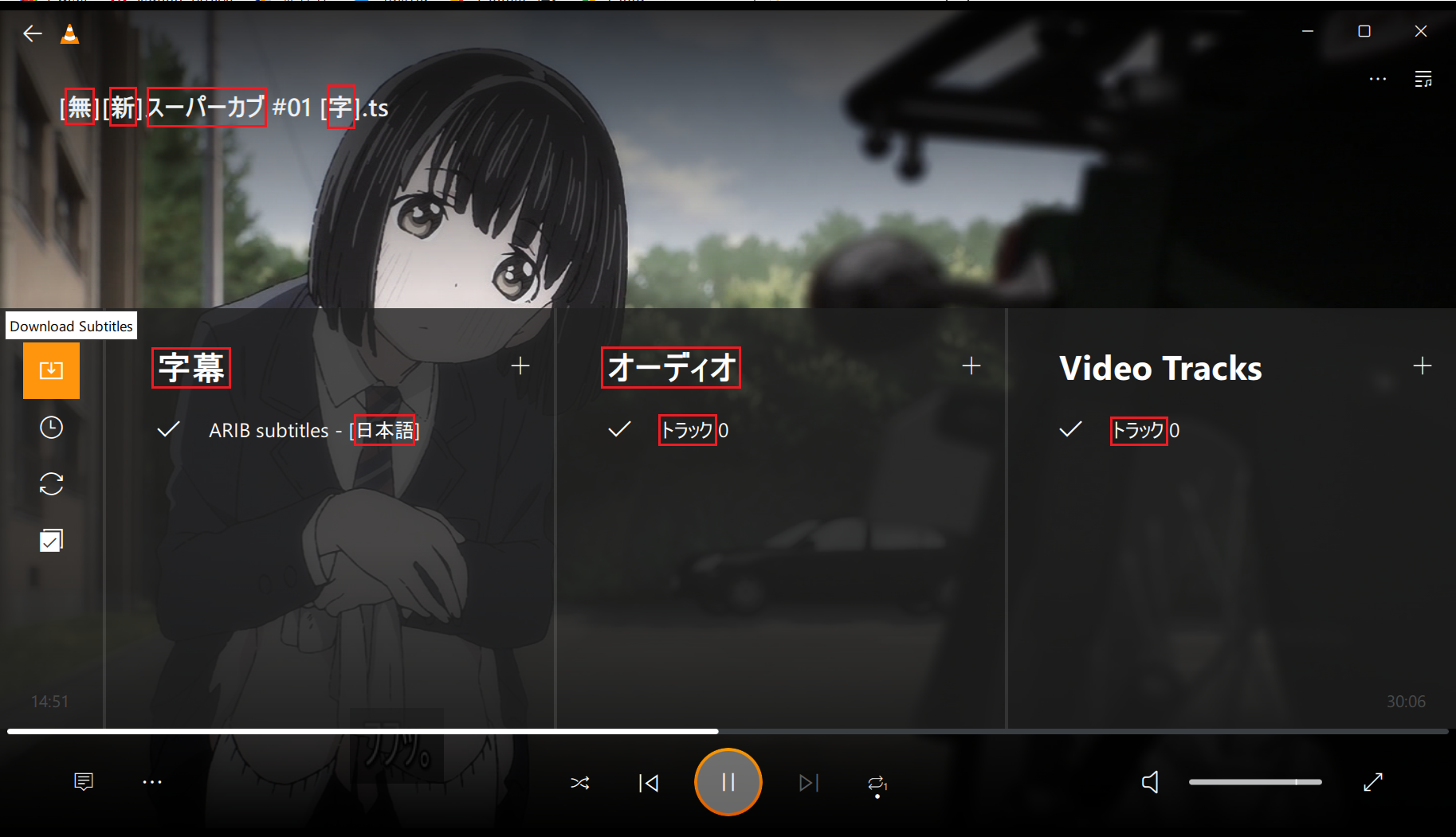
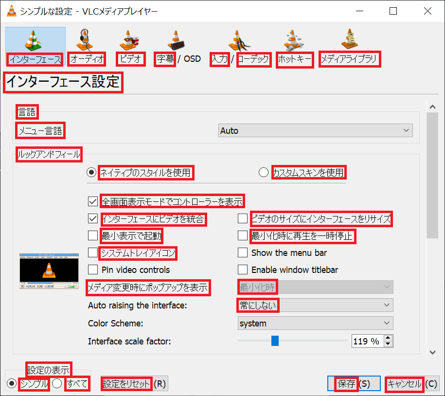
On Windows (Japanese edition), the substitute font is displayed in "MS UI Gothic"
I am Japanese. I recently learned that VLC 4.0.0 is being developed, so I installed the Nightly version of VLC 4.0.0 (https://artifacts.videolan.org/vlc/nightly-win64/20210422-0422/) on a Windows 10 (Japanese edition).
The UI is very clean and nice. However, there is a problem in the Japanese environment that the font "MS UI Gothic" is used as an alternative font for Japanese characters (Hiragana, Katakana, Kanji, etc.).
I think VLC 4.0.0 for Windows uses "Segoe UI" as the font. It is specified in https://code.videolan.org/videolan/vlc/-/blob/master/modules/gui/qt/pixmaps/windows-theme.conf.

I think Segoe UI is a very beautiful font. However, Segoe UI is an English font and does not contain Japanese characters.
Japanese characters will be automatically displayed in the alternative font, but in VLC the alternative font is "MS UI Gothic" (the part surrounded by red in the image).
"MS UI Gothic" is a legacy Japanese font that has been included since Windows 98. Its design focuses more on being clearly visible on the low resolution displays of the time, rather than on beauty.
I don't think anyone but the Japanese can understand it, but "MS UI Gothic" isn't beautiful on today's high-resolution displays, it's dirty and ugly.

Also, in MS UI Gothic, characters below 20dot are displayed in bitmap font (the part surrounded by red in the image) so that they can be clearly seen on low resolution displays (reference: https://industry.ricoh.com/font/ms/). Full HD displays are now commonplace. Bitmap fonts are obsolete and reduce visibility on high resolution displays.
Alternatives to MS UI Gothic on Windows include "Meiryo" (Windows Vista or later) and "Yu Gothic (Windows 8.1 or later)" in standard fonts. These fonts are beautiful.
(However, mysteriously, the weights of "Yu Gothic" are "Light" equivalent to "Thin", "Regular" equivalent to "Light", and "Medium" (Windows 10 or later) equivalent to "Regular". So, if you use the "Yu Gothic" Regular weights as an alternative font, there is a problem that the weights look thinner than "Segoe UI".)
If you can use third-party fonts, you have more choices.
"Noto Sans CJK JP" (https://github.com/googlefonts/noto-cjk/tree/main/Sans/OTF/Japanese) or "Source Han Sans Japanese" (https://github.com/adobe-fonts/source-han-sans/tree/release/OTF/Japanese/) contains almost all Japanese characters. I think it's a beautiful, versatile and easy-to-read design.
"Noto Sans CJK JP" and "Source Han Sans Japanese" are fonts co-developed by Adobe and Google, with different names but the same design.
"M+" (https://mplus-fonts.osdn.jp/about-en.html) features a softer design than "Noto Sans CJK JP". There are two designs, "M+1" and "M+2". "M +" is also a beautiful and easy-to-read font.
Both are fonts that do not feel strange when mixed with "Segoe UI".
Anyway, my opinion is "Stop using "MS UI Gothic" as an alternative font to" Segoe UI "in the Japanese edition of Windows and change to a more beautiful and readable font."
I use Google Translate, so the text may look unnatural.
Thank you for your consideration.